The meaning behind our brand
2 minutes to read
Six months ago today, we were celebrating the launch of our new brand. To mark the anniversary, I thought I’d share a little insight into the meaning behind the image.
Community
From very early on in the rebranding process, we had an inkling that a circular logo was the way to go. Our service is all about people – our staff, our customers, our community. A circle felt inviting, inclusive and friendly. And it was because of this emphasis on people that our brand characters were born. It was all about creating a community that people want to be part of.

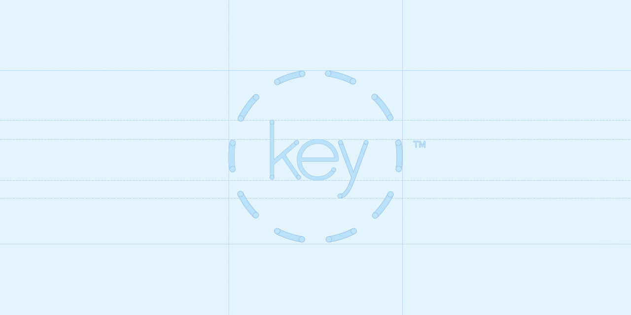
Flexibility
There’s a reason that the circle in our logo isn’t closed. The gaps show that we’re open and flexible; our service isn’t restrictive. It also represents our openness to new ideas – we constantly learn, adapt and evolve to make sure our service is the best it possibly can be. We aren’t afraid to challenge the status quo.
Variety
If there’s one word to describe our logo, it’s ‘colourful’. Inspired by a colour wheel, it uses a spectrum of colour to demonstrate the variety of support we offer to our customers. It’s represents everything that Key is and will be in the future. It’s also bright, bold and fresh, which gives you a little insight into our internal philosophy.
Services
One goal of the rebrand was to give Key and its products a shared visual identity, so that people could tell they belonged to the same family. The new logo for our Umbrella service, Key Portfolio, shows that it’s part of Key. It also looks a bit like a door key, but that’s just a coincidence! When we launch new products in the future, they will follow this branding format too. Stay tuned…
![]()
Quality
People look at a brand and can’t help forming a perception of the service that lies behind it. Over the years, we’d built a company we were proud of. Now, we needed an image to match. Starting with our logo, we crafted a visual identity that mirrored the quality standards our customers have come to expect from us. It’s simple and uncluttered, just like our service.
History
Although we were giving Key a fresh new facelift, we also wanted to honour our history; our foundations. We’ve had a few different logos in our time, but they’ve all used a similar font. Our new logo keeps that tradition alive, with the font serving as a link to all that has gone before.